







In your pubspec.yaml
dependencies:
  badges: ^4.0.0
Attention! Material ships its own Badge widget, so to escape the ambiguous imports you need to import the package like this:
Option 1: namespace prefix
import 'package:badges/badges.dart' as badges;and then use the "badges.Badge" widget instead of the "Badge" widget. The same for all the classes from this package.
Option 2: hide Flutter's Material Badge widget
import 'package:badges/badges.dart';
import 'package:material_ui/material_ui.dart' hide Badge;
// or, if your app hasn't migrated to material_ui yet:
// import 'package:flutter/material.dart' hide Badge; badges.Badge(
badgeContent: Text('3'),
child: Icon(Icons.settings),
) badges.Badge(
position: badges.BadgePosition.topEnd(top: -10, end: -12),
showBadge: true,
ignorePointer: false,
onTap: () {},
badgeContent:
Icon(Icons.check, color: Colors.white, size: 10),
badgeAnimation: badges.BadgeAnimation.rotation(
animationDuration: Duration(seconds: 1),
colorChangeAnimationDuration: Duration(seconds: 1),
loopAnimation: false,
curve: Curves.fastOutSlowIn,
colorChangeAnimationCurve: Curves.easeInCubic,
),
badgeStyle: badges.BadgeStyle(
shape: badges.BadgeShape.square,
badgeColor: Colors.blue,
padding: EdgeInsets.all(5),
borderRadius: BorderRadius.circular(4),
borderSide: BorderSide(color: Colors.white, width: 2),
borderGradient: badges.BadgeGradient.linear(
colors: [Colors.red, Colors.black]),
badgeGradient: badges.BadgeGradient.linear(
colors: [Colors.blue, Colors.yellow],
begin: Alignment.topCenter,
end: Alignment.bottomCenter,
),
elevation: 0,
),
child: Text('Badge'),
),onTap: when the badge sits outside its child (negative position values), the badge adds padding around the child so the whole badge can be tapped. Flutter only delivers taps inside a widget's bounds. The padding makes the widget bigger, so leave onTap null if you don't need it.
ignorePointer: true lets taps pass through the badge to the widgets below it (and onTap is not called).
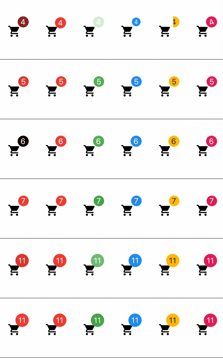
1) Color change animation 2) BadgeAnimation.slide 3) BadgeAnimation.fade 4) BadgeAnimation.scale 5) BadgeAnimation.size 6) BadgeAnimation.rotation
Also, loop animation is available, this will loop the animation until you stop it.
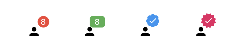
1) BadgeShape.circle 2) BadgeShape.square 3) BadgeShape.twitter 4) BadgeShape.instagram

Other Flutter packages from the same team:
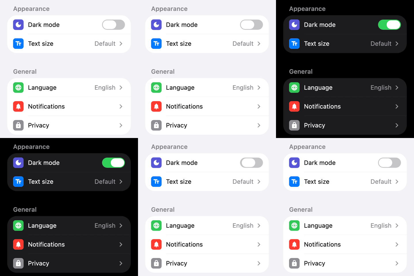 settings_ui Settings screens that look native on every platform. |
 yako_celebrations Full-screen celebrations in one line: confetti, coins, fireworks, flames. |
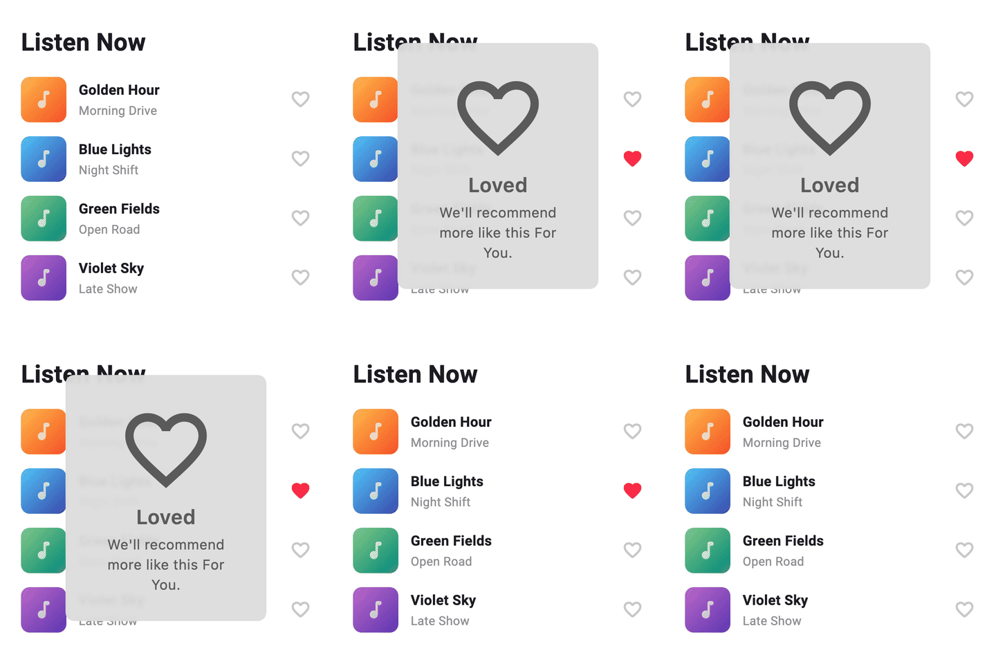 status_alert Apple-style status alerts that hide themselves. |
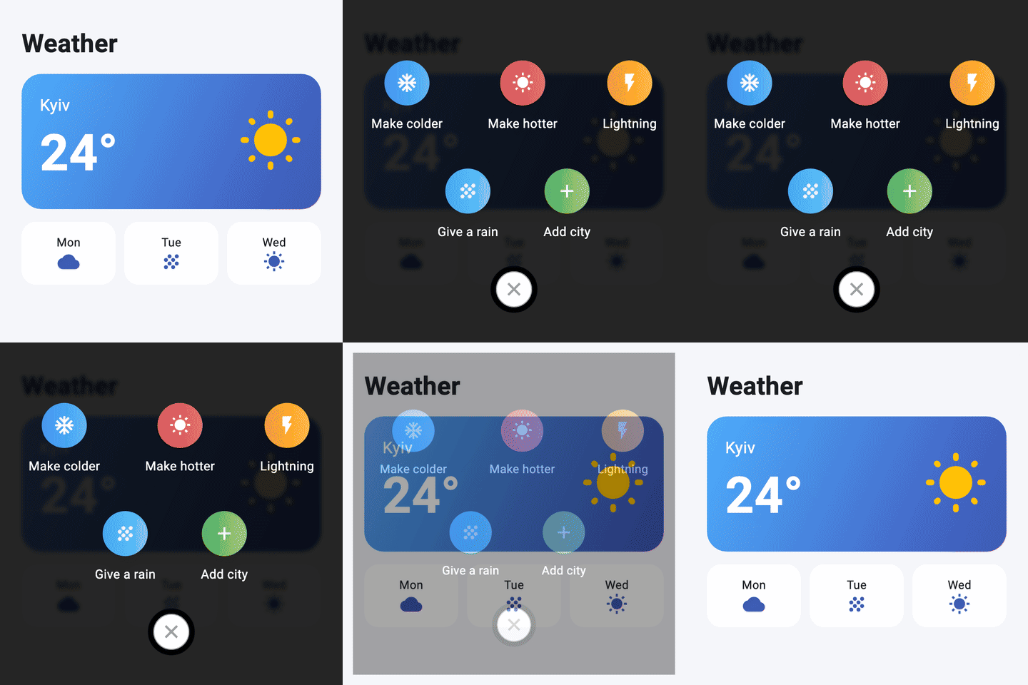 full_screen_menu A full-screen menu with round gradient buttons. |
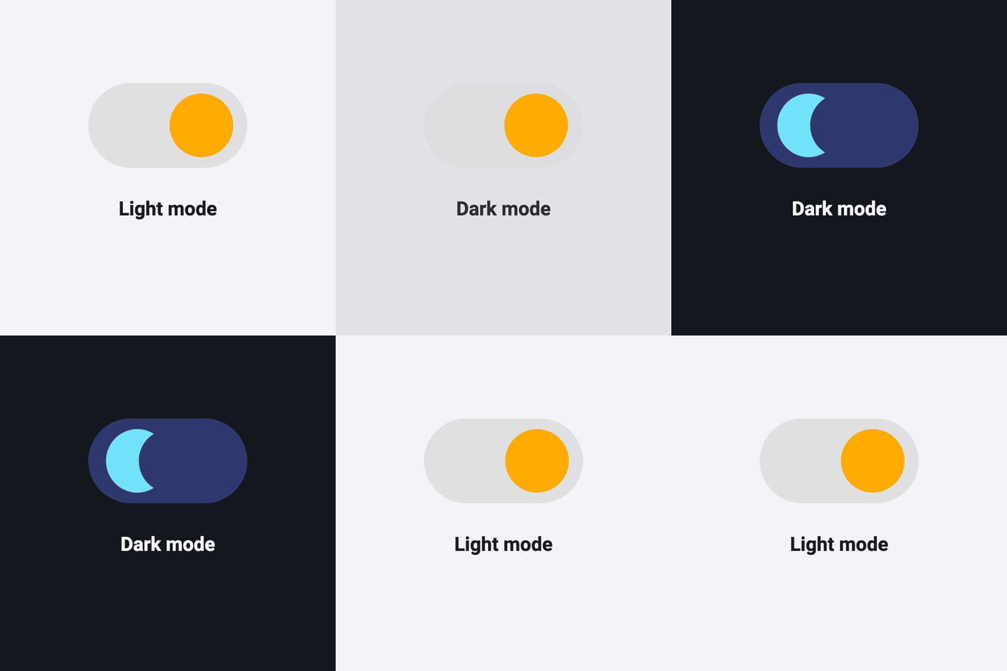 yako_theme_switch An animated switch between light and dark themes. |
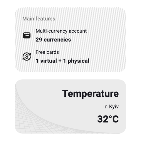 diagonal_decoration Diagonal-line and mesh backgrounds for boxes. |